Oshawa to gradualy retire its ‘Prepare to be Amazed’ slogan
Published November 24, 2022 at 3:26 pm
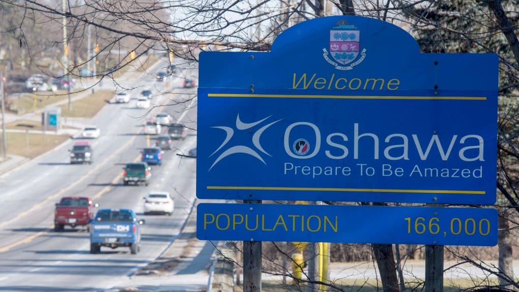
Oshawa is preparing to retire their 16 year-old ‘Prepare to be Amazed’ logo in time for centennial celebrations in 2024.
The item came up at the November 21 council meeting where councillors were assured the exercise was not a re-branding but rather a phase-out of the tagline, which was developed with much fanfare and more than a year of consultations at a cost of about $200,000.
Staff will continue to use the four-colour ‘Oshawa’ logo in the future, just without the tagline. The logo is a contemporary representation of a central hub with open ended paths. The four quadrants created by the coloured arc shapes represent Oshawa’s most dynamic sectors coming together:
- Blue: Recreation, Arts & Culture and Tourism
- Green: Gardens, Natural Spaces and Environment
- Orange: Innovation and Industry
- Purple: Rich Heritage
A re-branding would be a “significant and expensive process,” said CAO Tracy Adams in explaining why the phase-out would be gradual. Removing and replacing all the signage would cost $75,000 to $100,000, so replacing any signs would be discussed as needed in the capital budget.
“This is a retirement plan,” said Councillor Derek Giberson, “for a slogan that was useful in its time. But it’s time to move on.”

Videos