For the ‘W’ – Welland rebrands the city with a new logo
Published March 30, 2023 at 11:01 am

Welland has released the finished version of its brand new logo – with an emphasis on the ‘W’.
In the end, the last but still present logo wasn’t around very long as the city adopted it in July 2016, not even seven years ago.
Regardless, the new tri-coloured logo, featuring blue, green and yellow, was approved by City Council on March 28 and the city said it’s meant to reflect Welland’s “unique geographical and natural amenities and themes of connection, both in a physical sense and from a relational perspective.”
“It’s an exciting time to be in Welland, and moving forward with a revitalized brand injects further excitement into projects underway and those coming to the city,” said Marc MacDonald, Welland’s corporate communications manager.
“Based on the community consultation, the brand reflects traits and values important to the residents and will guide the City in its marketing, communications, and development.”
This time, the city relied more heavily on public input than the previous one had with designers Cinnamon Toast New Media Inc. coming up with the colourful single letter. Welland consulted the public from May to July 2022 “through digital surveys, focus group sessions, and one-on-one interviews.”

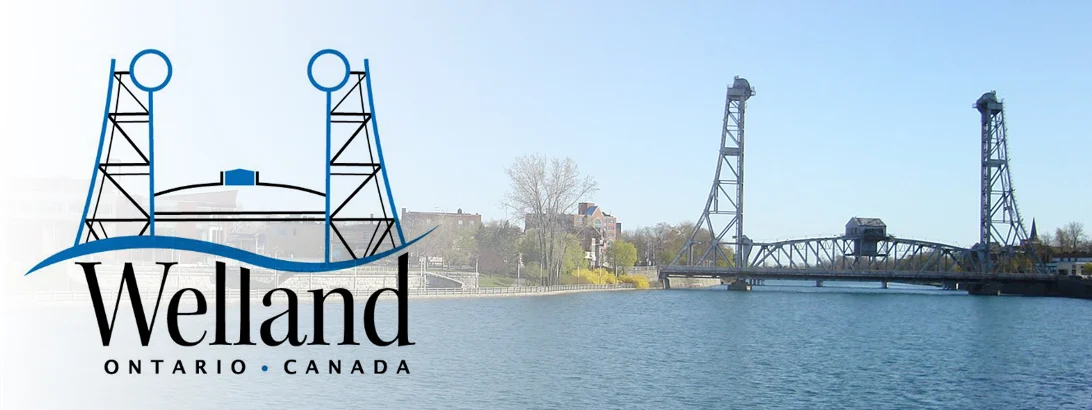
The city’s old (and still present) logo, left, featured the East Main Street Bridge, was built in 1927-1930 during the construction of the Fourth Welland Canal.
The City’s current logo, designed by Welland resident and then graphic arts student Sarah Marko in 2016, was not subject to the same consultation, design accessibility, or research as the newly adopted one.
Marko’s design incorporated Bridge 13, she said at the time, because “Ever since I was a young girl growing up in this lovely community driven City, the Welland bridge always stood out as an important symbol of our City through my eyes.”
The city said the new logo’s inspiration comes from the canal that carves its way through the city. “The logo’s bold ‘W’ shape reflects the fluidity of water, the connection between communities, and the theory of movement and constant evolution.”
“With a colour palette of blues, green, and yellow, the colours are representative of the waterway, nature, and new beginnings.”
Though adopted this week at council, the brand’s official launch will occur in May, alongside a redesigned City website.
insauga's Editorial Standards and Policies advertising


