
Branding a ‘new’ downtown – Oshawa and the ‘DTO’
Published June 10, 2022 at 9:28 am
Branding campaigns are often dismissed as exercises in words and symbols, ultimately signifying nothing. Sometime a catchy slogan works for a time, but then is forgotten, like fleeting gossamer drifting in the wind.
Other times, it just damn works, especially if we’re talking slogans dreamed up by fancy marketing companies, such as Las Vegas’ wildly successful ‘What Happens in Vegas, Stays in Vegas’ or New York’s ‘The City That Never Sleeps.’
Branding a city, or in this case, downtown Oshawa, with a slogan or motto is one thing. But doing it without any sloganeering at all is quite another. And one that requires a level of creative skill from the branding partner, dedication to executing the campaign from the City of Oshawa and its team, and most importantly, understanding and acceptance of what’s at stake from the citizens.
If the residents and business owners dismiss the campaign as meaningless or worse: a “waste of taxpayers’ money,” the branding campaign will be for naught. And if there’s even a hint of bafflegab or bullshit, those same citizens will reject the concept out of hand. After all, when it comes to talking smack about Oshawa, we don’t need any help. We have always been our own worst enemy.

Videos


But according to Matthew Aubie, the creative director of Toronto-based Aubs & Mugg Inc. and the brainchild behind the design, keeping the brand real and authentic is at the core of the whole exercise. If it’s not authentic, he said, it won’t work.
“Downtown Oshawa is a place that should not be defined by a few words,” he said in his presentation to Oshawa’s Development Services Committee Monday. “Any effort to capture the spirit and identity of downtown Oshawa in a tagline would be disingenuous to the place.”
And as Tony Hardy of Canny Creative of north England famously put it in 2018, taglines and slogans are “bought and paid for and meant to be consumed, like corn flakes.”
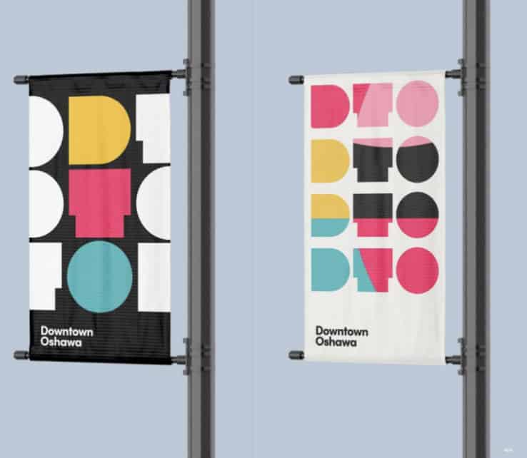
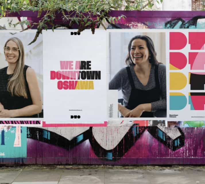
Which is why there is no tagline, no slogan or motto at all. Just three letters – DTO – in a unique font that can be adapted to work in a variety of formats – from letterhead, banners and signs to full-on media campaigns – and in a variety of vibrant colours and designs.
The idea is that over time, the letters with that special font will no longer spell ‘DTO,’ but come to symbolize Oshawa’s downtown. “No one knows what ‘DTO’ is. But over time these symbols become iconic.”
The font and the actual design of the three letters is what sets them apart, and why Aubie resisted making them more like regular letters, he pointed out in response to a question from a councillor on why the ‘T’ only kinda sorta looks like a T. “The closer you make them into proper letter forms the less iconic they become. They become just letters.”
“We don’t want them to read ‘DTO.’ We want these symbols to read ‘Downtown Oshawa.’”
Oshawa certainly isn’t the first city to brand itself with little more than a symbol. The City of Melbourne, Australia brand is a stylized ‘M’ that, just like the Oshawa design, can be adapted for many different uses using many different colours and designs. And if you believe the Lord Mayor of the Australian metropolis, it has been a ‘bonza’ campaign.
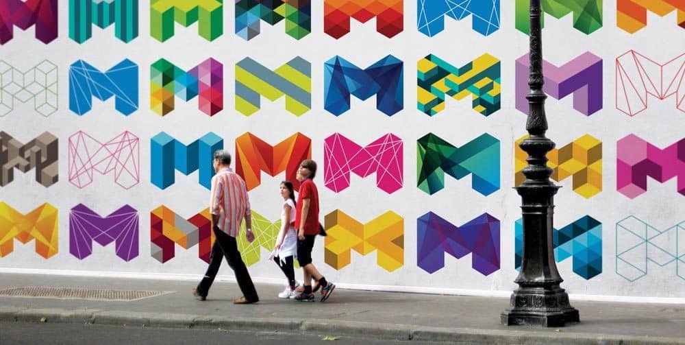
The City of Melbourne, Australia re-brand
“The ‘M’ design will become an icon for Melbourne,” enthused Robert Doyle in 2010, “synonymous with the vibrant, modern, cool city Melbourne is today and will continue to be in the future.”
Twelve years after the re-brand the ‘M’ is still in use and Melbourne’s brand value had grown by 15 per cent. That’s the kind of impact Oshawa was looking for when they put out a call in early April for companies with experience in branding to produce a new Downtown Oshawa Visual Identity. Aubs & Mugg beat out three other rivals to win the bid in early May and started work immediately.
Nine weeks later they were in the council chambers with their presentation.
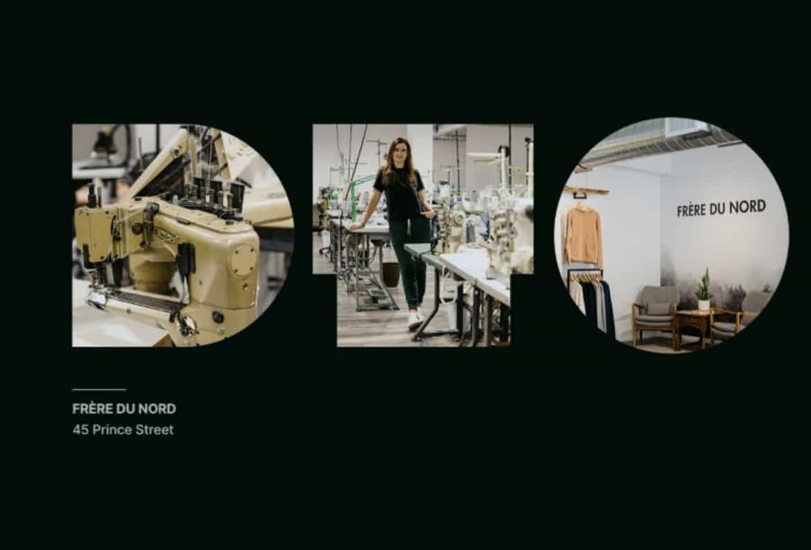
They conducted 31 one-on-one interviews with internal contacts, stakeholders and members of the public who completed the feedback form and supported a photo shoot which led them to micro-manufacturers, coffee shops, record stores and other retailers, as well as restaurants and Ontario Tech’s downtown campus.
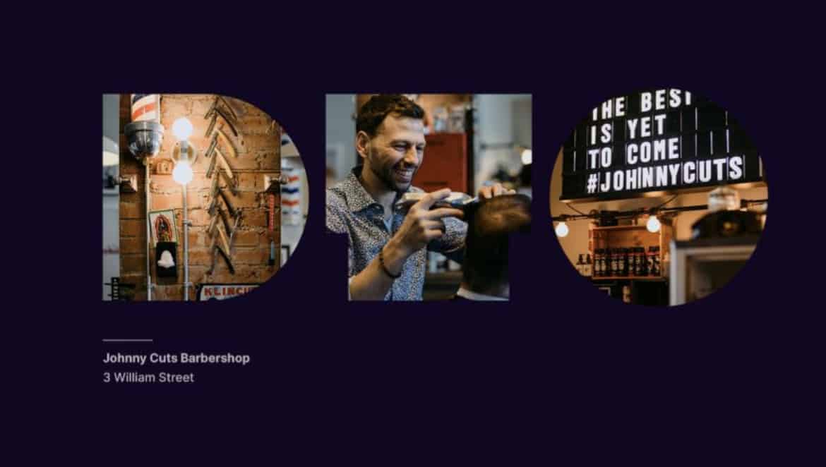
The on-the-street contact was important to the whole exercise, explained Aubie, who said that the true narrative of the city’s downtown is largely focussed on social situations.
“Downtown Oshawa is a place of genuine humanity,” he said. “The visual identity needs to help humanize the downtown by bringing greater visibility to the entrepreneurs, restaurateurs, community leaders, artists, residents, students, and visitors who are actively working to make the area a compelling, attractive, and accessible place. “
Besides, he added, despite the work his company performed being about branding, “downtown Oshawa is not a brand. It is a place, and place is created when we take raw space and infuse it with meaning, purpose, creativity, invention, and passion. “
Much of the inspiration for the design came from visual clues in the architecture – there are plenty of solid concrete structures in the graphics, all resonating a “heritage of strength,” Aubie called it.
“It’s heavily inspired by the physicality of downtown Oshawa – bold architecture and prominent use of materials such as concrete and brick. This foundation to the identity is then brought to life – just as the physical spaces are – by showcasing the people and opportunities found throughout downtown Oshawa. “
The design is also meant to stand out; to be loud, much like the streets of the downtown. As Aubie quite romantically described it, there is an “undeniable energy” built into the brand. “It is not representing the quiet, quaint main street of a typical Ontario city. It is a place that requires movement, and it is powerless to its unpredictable beat. Downtown Oshawa is a melting pot of sound; metal clangs, traffic hums, guitars strum, crowds roar (and) the DTO brand leans into this building cadence and rhythm.”
The design is also meant to reflect the hard-scrabble, hard-working history of the citizens of Oshawa, he said, adding he believes the people of Oshawa are “self-assured and grounded” and “take pride in their uniqueness, celebrate the quirks of their community, and demonstrate confidence by not shying away from their rough edges.”
Hailey Wright, Oshawa’s Director of Economic Development Services, and the person who will be largely responsible for executing the branding campaign, can’t wait to get started.
“My excitement around this proposed brand is the flexibility in the design, colours and breadth of information to communicate from the Economic Development office. There is opportunity for bold, bright play when communicating events or new art installations, while there is also the opportunity to produce engaging and professional investment and recruitment packages to attract new business to the community,” she said. “I am excited about the play on heritage, and that the proposed visual identity feels bright, engaging and diverse.”
Wright was impressed with how much work Aubs & Mugg put in, especially in dealing with Oshawa’s eclectic mix of downtown residents and retailers. That “human element” that is transforming the downtown every day is “a piece of the story that is often missed” when studying urban areas, she added.
“The opportunity to reconnect with that position and find ways to intentionally seek out the individual stories responsible for building the diverse and vibrant downtown is something I look forward to communicating more effectively going forward.”
Aubie agreed that the design allows for considerable flexibility, noting that as the downtown continues to be “re-imagined,” the proposed visual brand identity also adapts to the communications it needs to support.
“From marketing an upcoming festival, engaging residents for feedback, to encouraging economic growth, the proposed visual brand identity is built to serve the betterment of downtown Oshawa. The brand principles will articulate intentional qualities, inform decision making and act as an internal tool to effectively communicate downtown Oshawa to a broad audience.”
Jason King, the CEO of the Greater Oshawa Chamber of Commerce, also came away from the presentation with positive vibes.
“I think it’s a bold-looking brand that gives the City folks a lot of flexibility to visually convey the different cultural aspects of the downtown,” he said. “I’m very interested to see what they do with it over time.”
King admitted the difficulty in using something as simple as three letters and a certain typeface to illustrate the growth happening in Oshawa’s downtown, but he believes the design can work.
“It gives it almost a visual taxonomy to use to convey all the cultural, business and culinary initiatives downtown,” he said. “It’ll be fun and it’ll be accessible for tourists and students from around the world. But it’s also us who will now be looking at the city in a new lens.”
That ‘new lens’ is important to the campaign; partly because – as previously mentioned – we are often our own worst enemy when it comes to dismissing the attributes of Oshawa; but mostly because most people who responded to the feedback form and Aubs & Mugg’s public engagements saw “potential” in a changing downtown.
But the new Downtown Oshawa Visual Identity must take a bold position, Aubie told committee members, by “shifting the narrative from potential to action.”
“As initiatives from entrepreneurs, residents, students and the City evolve the downtown, the visual identity must act as a communication tool to support the progress and make visible the work being done. “
The proposed new visual brand identity is designed to act as a communication platform for the City, he added, calling it a “tool” that will deliver “clearer messaging, stronger marketing, opportunities for beautification, and an authentic identity” to act on the downtown’s potential.
Oshawa Mayor Dan Carter was also impressed by the presentation, saying he believes the design captured the “unique urban quality” of the downtown and its heritage.
If there’s one message Aubie learned in his research, it is that there is no singular story of downtown Oshawa. “Instead, it is an anthology of creativity, entrepreneurship, industriousness, and humanity. The proposed downtown Oshawa visual brand identity is designed to be a platform for those stories, connecting with those already in love with the places, and those yet to discover how exciting, authentic, and accessible downtown Oshawa can be.”
insauga's Editorial Standards and Policies advertising