
Mississauga’s New City Brand Unveiled
Published February 26, 2014 at 4:32 pm
A new brand for the City of Mississauga was unveiled today at a presentation to General Council (GC), together with the corporate report and brand implementation plan. The report will go to Council on March 5 for approval.
“As our City approaches its 40th anniversary, Mississauga today is quite different than the Mississauga of yesterday, and as we consulted with stakeholders across the City, the consensus was that it was time to refresh Mississauga’s logo and develop a new brand for the City,” said Janice Baker, City Manager and CAO. “Our new brand reflects the excitement that is everywhere in Mississauga.”
According to the report, the new brand communicates an authentic and aspirational story of the dynamic city Mississauga is today. The brand story is based on three key ingredients; Welcoming World Culture, Naturally Enriching and Inspiring Possibilities.
A brand launch and implementation plan has been developed to introduce and build awareness of the brand among residents and key audiences. The roll-out of the new city brand will be carried out in a cost-effective multi-year plan.
The new logo was designed by the City’s Creative Services team. “The new “M” logo is a bold and modern identifier for a young city on the cusp on something big,” said Ivana Di Millo Director, Communications. “We are so excited to be embarking with our partners to showcase all that Mississauga has to offer.”
Background:
Council requested and approved staff to complete a Brand Research Project as part of the 2013 business plan. This was also a key recommendation of the Communications Master Plan (which was approved by Council in May of 2012). The summary report for the Master Plan identifies the need to develop a strong, unified brand reputation for the City that is rooted in its strategic vision.
Videos


Here’s what people have to say on Facebook, Twitter and Instagram: ![]()

Ryan Tobin I like.
Sayed Khader “You’ve got mail!”
Andrew J. Wood Why are the a’s and u’s lower case? Not a huge fan of this at all
Linda Garbig Mallory Looks like a geometry drawing.
Remi Ejiwunmi I like their three elements (Welcoming World Culture, Naturally Enriching (not entirely sure what that means?) and Inspiring Possibilities) but I have no idea what in the image represents those concepts?
Tina Hung I find the geometric M very futuristic… it’s interesting but I’m indifferent.
Randall Clint McKeown I don’t like it!
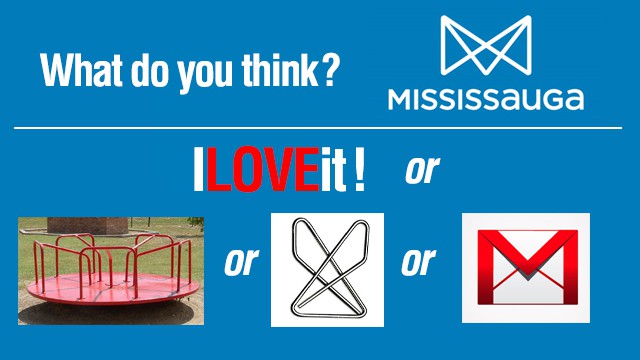
Jojy Philip Abraham Do NOT like it. The graphic M made think of an envelope. And the lower case a’s and u’s are unnecessary. Does not represent our great city at all.
Filipe Morais Not fan…should b tridimensional…or subject to public contest, I’m pretty sure they are out there great minds that could do a better logo.
Mike Zee Illuminati
Aaron Ker I liked the old one 🙁
Andrew Gurudata It lacks colour and depth. My favourite civic branding is Laval, in Quebec. http://upload.wikimedia.org/…/432px-Flag_of_Laval…
![]()

anitachickita #lackluster #unimaginative #truth I don’t like it
mlchiasson I like it! #Fresh #Modern
cosmickitteh Eerrrrr no
akira_ran It looks like the City of Mississauga just received a weird email notification from facebook…or a logo for a company that makes those paper fortune teller origami that kids played with
yamotholic fail
roach_bot I like it, it’s simple
mrbcullum Fail… epic…
deeshasarai No
flora_laura85 Boring![]()

@albertfong
mIXing cAPs & lOwER CASe bUgs mE MT @insauga: Mississauga’s New City Brand Unveiled.
@JoolAdventures @insauga clever with 2 M’s AND 2 arrows pointing upward for progress
@amondzli@albertfong @insauga but it’s so ugly…
@Snijeg82@insauga is it just me or the new mississauga logo is not that good.I dont see how it says anything about the brand.#confused #dissapointed
@jjRoni
A paperclip? RT @insauga Mississauga’s New City Brand Unveiled. What do you think???
@velascocreative
My city trying to be hip! “@insauga: Mississauga’s New City Brand Unveiled.
INsauga's Editorial Standards and Policies